

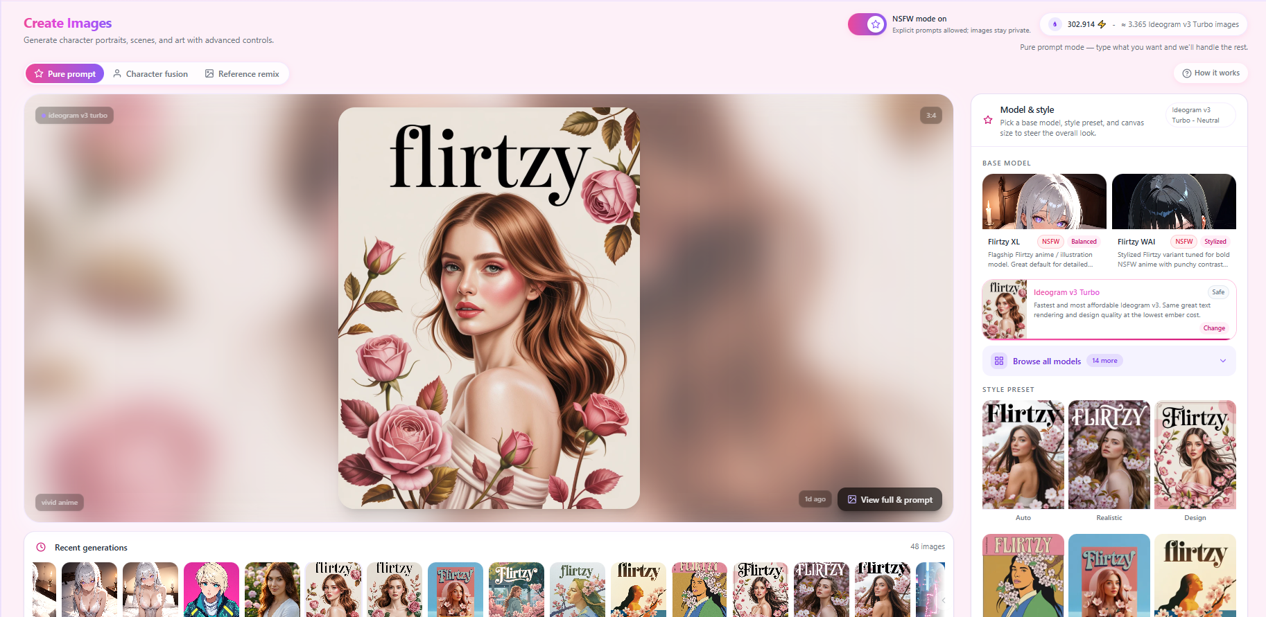
Image Studio 2.0 — 16 Models, New UI & Smart Prompt Bar
The Create Images studio has been completely rebuilt from the ground up. Choose from 16 AI models across five categories, use the redesigned prompt bar that puts all generation controls in one place, browse models with a cinematic dark-themed picker, and enjoy a dramatically improved mobile experience with drag-to-scroll history, hover-reveal previews, and a near-fullscreen image viewer.
16 AI Models Across Five Categories
- Anime & Illustration: Flirtzy XL, Flirtzy WAI, Animagine XL 3.1, Animagine XL v4 (with PAG enhancement), and Flux Aesthetic Anime (Ghibli-retro aesthetic)
- Photorealistic & Cinematic: Seedream 4.5 (ByteDance, film-like lighting), FLUX 1.1 Pro Ultra (up to 4MP resolution), Grok Imagine (xAI, moody cinematic), FLUX Dev Realism (natural skin textures and photographic quality)
- Artistic & Design: Recraft V4 (precise text rendering inside images — yes, it can write words), Lucid Origin (vibrant painterly style), FLUX Dev + LoRA (apply any custom style from HuggingFace or CivitAI)
- Design & Text: Ideogram v3 Balanced and Ideogram v3 Turbo — the only models on the platform that can reliably render readable text, logos, and typography inside generated images
- Fast & Budget: Imagen 4 Fast (Google, high quality at low ember cost) and FLUX Schnell (sub-second generations at the absolute lowest cost — great for rapid prompt exploration)
Each model has a real sample image card, a description of what it excels at, its ember cost per image, and a color-coded NSFW support badge so you always know what you are picking before you generate.
New Model Picker Modal
The old two-button model selector has been replaced by a full cinematic dark-purple model browser — consistent with the design language of the media viewer and other isolated components on the platform.
- Search with relevancy ranking — results are scored across model name, description, and tags so the most relevant models appear first
- Filter by category: Anime & Illustration, Photorealistic, Artistic, Design & Text, or Fast & Budget
- Filter by NSFW support level — show only Full NSFW models, Light NSFW models, or Safe only models
- Sort by cost — cheapest first or priciest first to match your ember balance
- Every model card shows a sample image, ember cost per generation, preset count, and a colored NSFW badge with a hover tooltip explaining exactly what each level means (Full NSFW, Light NSFW, Safe only)
- The filter bar automatically collapses on mobile when you scroll down through models to give more screen space, and smoothly reappears when you scroll back up
- Flirtzy XL and Flirtzy WAI are marked as Featured in the modal — the two flagship models always easy to find
The Prompt Bar Is Now a Full Generation Engine
The text input area has been rebuilt into an all-in-one generation control center. Four pill buttons are embedded directly inside the input border so you never have to leave the prompt to configure your generation.
- Model pill — shows the active model with its thumbnail. Tap to switch from a quick list or browse all 16. Opens a full bottom sheet on mobile.
- Aspect ratio pill — shows current ratio with a proportional shape indicator. Tap to switch between Square, Portrait, Story, Landscape, and Widescreen. Models that only support certain ratios show only their valid options.
- Batch size pill — shows how many images will be generated using a dot grid. Tap to choose 1×, 2×, or 4×.
- Style preset pill — appears only when the selected model has style presets. Shows the active preset name with a colored dot. Tap to browse all presets with thumbnail previews.
All four dropdowns use smart viewport-aware positioning — they always open toward the visible screen and never clip off the edge. Clicking outside or into the text area closes the active menu instantly. On mobile the four pills form a clean 2×2 grid with the Generate button spanning full width below — no more cramped controls.
Style Presets with Visual Preview Cards
Models that support style variations now show a visual grid of real generated thumbnail images for each preset instead of plain text buttons. This lets you see the actual aesthetic difference before choosing.
- Hovering over any preset card for half a second opens a larger floating preview showing the full-quality image alongside the preset name — compare styles instantly without selecting
- A small expand icon on each card opens it in a fullscreen cinematic lightbox so you can inspect full detail before committing
- The active preset shows a pink-to-violet gradient checkmark in the top corner
- Preset images are stored at full resolution with auto-generated thumb versions for fast grid loading
Style presets are available for: Flirtzy XL (5 presets: Neutral, High Quality, Soft & Dreamy, Vivid Anime, Ultra Detail), Flirtzy WAI (6 presets: Neutral, Vivid, Soft Glow, Bold & Sharp, High Detail, Raw Energy), Animagine XL 3.1, Animagine XL v4, Flux Aesthetic Anime, Seedream 4.5, FLUX 1.1 Pro Ultra (Standard and Raw/Natural), FLUX Dev Realism, Lucid Origin (6 presets), Ideogram v3 Balanced (8 presets including Auto, Realistic, Design, Anime, 3D Render, Vintage Poster, Watercolor, Art Deco), and Ideogram v3 Turbo (same 8 presets).
Generation Canvas Metadata Chips
Four subtle frosted-glass chips now appear in the corners of the image canvas giving you instant context about the displayed image without opening any modal.
- Top-left: model name with a violet dot
- Top-right: aspect ratio
- Bottom-left: active style preset (only shown when a non-default preset is active)
- Bottom-right: generation time (e.g. 2h ago) sitting alongside the View full & prompt button
Improved Full Image Viewer
- Near-fullscreen — uses 95% of viewport width and height
- Aspect-ratio-aware sizing — portrait images get a narrow modal that hugs them tightly, landscape gets full width. No more massive dark borders on either side of a vertical image.
- The backdrop is semi-transparent so you can still see the page context behind it
- Full metadata panel at the bottom: Model, Aspect, Style, Steps, CFG Scale, Seed, and Generation time — all extracted from stored generation data
- Full prompt displayed below the metadata with clean overflow handling
Generation History Strip — Completely Rebuilt
- Drag to scroll — click and drag anywhere on the strip to navigate. Drag tracking follows the mouse even when it leaves the strip so fast drags never lose tracking and the cursor stays as a grab hand throughout.
- Left and right arrow buttons appear on hover for page-by-page navigation
- A persistent fade gradient on the right edge signals that more images exist beyond the visible area — improving discoverability without permanent UI chrome
- The browser scrollbar is hidden for a cleaner visual while all scroll interactions still work normally
- Hover any thumbnail to reveal its prompt text sliding up from the bottom — prompt text no longer clutters the image by default
- Infinite scroll — loads 48 images on open, automatically fetches the next batch as you scroll near the end. No load more button.
- While history is loading the strip shows 5 staggered pulsing skeleton cards so the layout stays stable
Mobile-Specific Improvements
- NSFW toggle and ember credit display compressed into a single horizontal row on mobile — saves meaningful vertical space
- Mode tabs and How It Works button share one row
- Recent generations strip and batch variants strip collapse by default — tap the header to expand
- Tag builder collapses by default — tap to expand when needed
- All prompt bar menus open as near-fullscreen bottom sheets on mobile
- Model picker modal fills 96% of viewport height on mobile
- All touch event handling rebuilt from scratch — selection issues that affected bottom sheet menus, style preset selection, model picking, and batch/aspect menus are all resolved
Visual Design Refresh
The entire page visual language has been updated in line with the platform's ongoing design direction — cleaner, crisper, and more professional.
- Sharper card borders with precise color replacing soft gradients throughout
- White card backgrounds replacing semi-transparent panels
- Uppercase tracking labels for section headers
- Pink-to-violet gradient on active states, selected cards, and the Generate button
- Purple accent integration alongside pink across active borders, checkmarks, and selections
- Cinematic dark overlay for the full image viewer and model picker matching the platform's newer isolated component aesthetic
- Browse all models button uses a distinctive violet background making it clearly recognizable
Skeleton Loading States
- While generation history fetches on page open, the canvas shows a subtle pulsing animation instead of an empty frame
- The history strip shows 5 staggered pulsing placeholder cards with a ripple timing effect during load
Ne düşünüyorsun?